ShopDreamUp AI ArtDreamUp

Deviation Actions


Description
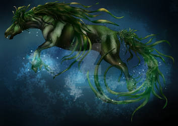
Size - A4, Time - 3.5 hours, Media - Letraset Promarkers, Paper - Letraset Comic paper.
I've started some non competitive art 'challenges' with some friends, they're mostly small things like try and draw this.., etc etc. The most recent ones have be themed challenges where we take in turns to name a theme and the rest have to draw something based on that theme. It can be pretty much anything, so long as it relates to the chosen theme in some way.
Second theme was chosen by a friend of mine, and I wasn't surprised when she chose 'Fairy' as the theme. I considered drawing a Fairy OC, or a fairy-like dragon, but ended up with a fairy-like horse creature. So I have drawn a fairy's equine friend, or foe. ^-^
Image size
1250x938px 1.04 MB
© 2014 - 2024 SaphireDragon16
Comments6
Join the community to add your comment. Already a deviant? Log In
As allways this is a really great animal design. I am really impressed by all the creative Ideas you have.
You have a very unique style, working very often with strong outlines. In this drawing you reduced this a little, which I personally think is really great. You have a very nice way of blending the markers.
You very often use manny separate lines to colour sth. and do not colour whole areas. While this get's a lot of movement into your drawings I think it may be helpful if you tried to take stronger into considerations which parts of the paintings are further behind, and make those darker, and those areas that are further in the front lighter.
Two examples:
Directly left of the bottom of the black pen there are two tips of the tail overlapping each other. The part of the tip furthest in the front is darkest. It would help the depth effect, if the part furthest in the front was lightest.
The blue tentacles (I'm only using this word in lack of a better one, sry) are dark somewhere in the middle (not allways the same place) and lighter on the edges. It would look better if they were darker on the edges, since it would then look as though they were curving slightly upwards.
It's a real pitty the photo is a little blurry around the head, because I think the horse is really cute!
As allways you yoused amazing colour combinations, that look great together!
This was written for Inspiring Creation.